
The Ultimate Guide to the Best Color Combinations for Linen Printed Fabric Projects
Release Time:
Dec 22,2025
Author:
The Ultimate Guide to the Best Color Combinations for Linen Printed Fabric Projects
Linen printed fabric projects have gained immense popularity due to their versatility, breathability, and timeless appeal. Whether you are a hobbyist or a professional designer, understanding color theory and selecting the right color combinations can drastically enhance the overall aesthetic of your projects. In this guide, we will explore the best color combinations for linen printed fabric, drawing inspiration from nature, trends, and traditional color palettes.
Table of Contents
- Understanding Color Theory
- The Psychology of Color in Fabric Design
- Top Color Combinations for Linen Printed Fabric
- Designing with Patterns and Textures
- Matching Color Combinations with Project Types
- Tips for Successful Color Blending
- Conclusion
- FAQs
Understanding Color Theory
Color theory is the foundation of effective design. It encompasses the principles that govern color combinations and how colors interact with one another. Colors can be categorized into three primary types: primary, secondary, and tertiary colors.
**Primary colors** (red, blue, and yellow) cannot be created by mixing other colors. **Secondary colors** (green, orange, and purple) are formed by combining two primary colors. **Tertiary colors** are created by mixing a primary color with a secondary color, resulting in hues such as red-orange or yellow-green.
Understanding the color wheel is essential for creating visually appealing designs. Complementary colors, which are opposite each other on the wheel, create contrast and vibrancy. Analogous colors, which sit next to each other, provide harmony and a sense of cohesiveness.
The Psychology of Color in Fabric Design
Colors evoke emotions and can influence the perception of a fabric's texture and pattern. For example, cool colors like blue and green often convey tranquility and calmness, making them popular choices for bedroom textiles. Warm colors such as red, orange, and yellow energize and invigorate, ideal for lively spaces like kitchens and living rooms.
When selecting colors for linen printed fabric projects, it's crucial to consider the intended atmosphere. For instance, if you're designing casual summer garments, light and soft colors might be preferable. In contrast, bold, rich colors could be more suitable for elegant evening wear.
Top Color Combinations for Linen Printed Fabric
Creating successful fabric designs requires an understanding of how colors work together. Below, we delve into some of the best color combinations for linen printed fabric projects.
Earthy Tones
Earthy tones, such as rich browns, deep greens, and soft tans, create a natural and organic feel. These colors are perfect for projects inspired by nature, such as home décor items or outdoor clothing. Combining shades like terracotta with olive green can result in a grounded and harmonious design, reminiscent of rustic landscapes.
Pastel Palette
Pastels are soft, muted colors that evoke a sense of calm and serenity. Combinations like blush pink with mint green or lavender with soft yellow are perfect for creating delicate and charming designs. These combinations work exceptionally well for spring and summer projects, such as lightweight curtains or children's clothing.
Vibrant Hues
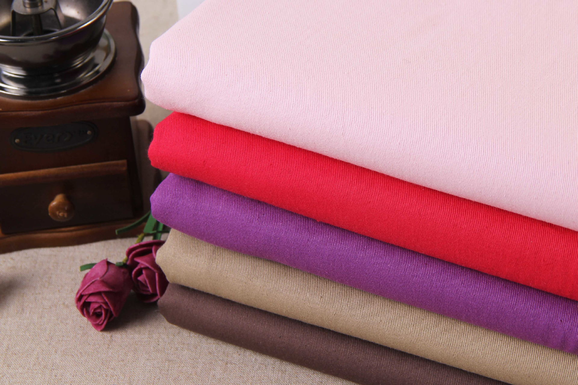
For bold and energetic designs, consider using vibrant hues like bright reds, electric blues, and vivid yellows. Pairing a vibrant color with a neutral base, such as white or beige, allows the bright hues to stand out while maintaining a balanced look. This combination is excellent for statement pieces, such as cushions or accent pillows.
Monochromatic Schemes
Monochromatic color schemes utilize variations in lightness and saturation of a single color. This approach can create a sophisticated and cohesive look. For example, varying shades of blue—from pale aqua to deep navy—can convey elegance and style. Monochromatic designs are particularly effective for formal settings, such as table linens for dinner parties.
Designing with Patterns and Textures
When working with printed fabrics, it's essential to consider both color and pattern. Patterns can enhance or detract from color combinations, so choosing complementary designs is crucial. For example, floral patterns in pastel colors can create a whimsical look, while geometric designs in bold colors may project a modern aesthetic.
Texture also plays a significant role in the perception of color. Linen has a natural texture that can soften vibrant colors, making them more approachable. When designing with linen printed fabrics, consider how the texture interacts with your chosen colors and patterns.
Matching Color Combinations with Project Types
Different projects may call for different color palettes. Here’s a breakdown of ideal color combinations based on common fabric projects:
Home Décor
For home décor items such as cushions or curtains, earthy tones and soft pastels create a cozy atmosphere. Consider pairs like sage green with creamy white for a fresh yet warm look.
Apparel
When designing clothing, vibrant hues can make a statement. A combination of rich teal and coral can create an eye-catching summer dress, while monochromatic schemes can lend sophistication to formal wear.
Accessories
Accessories can be an excellent opportunity to experiment with bold combinations. Try pairing neon colors with neutrals for a modern bag or scarf, or use complementary colors for a playful effect.
Tips for Successful Color Blending
1. **Test Swatches**: Always test your color combinations on small swatches before committing to larger projects. This allows you to see how colors interact and ensure they achieve the desired effect.
2. **Consider Lighting**: Color perception can change with lighting. Natural light often brings out the true color of fabrics, while artificial light can alter how hues appear. Test your fabrics in various lighting conditions.
3. **Limit Your Palette**: Too many colors can create chaos. Stick to a maximum of three to five colors to maintain coherence in your design.
4. **Use a Color Wheel**: A color wheel can help you identify complementary and analogous colors, making it easier to create visually appealing combinations.
5. **Stay True to Your Vision**: Ultimately, trust your instincts when selecting colors. Your personal style and vision should guide your choices.
Conclusion
Choosing the best color combinations for linen printed fabric projects is an art that blends understanding of color theory, psychological effects, and design principles. By exploring various palettes—including earthy tones, pastels, vibrant hues, and monochromatic schemes—you can create stunning and cohesive designs. Remember to consider the project type and how color interacts with patterns and textures for the best results. With the tips provided, you can confidently embark on your next linen printed fabric project and bring your creative vision to life.
FAQs
1. What are the best colors for linen printed fabric in home décor?
Soft pastels and earthy tones, such as sage green and terracotta, work beautifully for home décor.
2. Can I use bold colors for children's clothing made from linen?
Yes! Bright colors like yellow and orange can create fun and playful designs for children's clothing.
3. How do I choose a color palette for my linen printed fabric projects?
Consider the mood you want to create, test swatches, and use a color wheel to find complementary colors.
4. Are monochromatic schemes suitable for casual projects?
While they can be sophisticated, monochromatic schemes can also be inviting and casual, depending on the chosen colors.
5. How should I approach color blending with patterns?
Choose patterns that complement your color palette and ensure that the colors within those patterns work harmoniously together.
More Events

Bulk fleece fabric buying guide: types, weights, and where to order wholesale
A complete 2026 guide to buying bulk fleece fabric wholesale — covering GSM weight comparisons, fabric types, anti-pill specs, MOQ requirements, sustainability certifications, and how to choose the right fleece fabric supplier for your business.
Oct 09,2026
How to find reliable viscose fabric suppliers: a practical sourcing guide
Looking for reliable viscose fabric suppliers in 2026? This practical sourcing guide covers MOQ, certifications, and a ready-to-use RFQ checklist for procurement teams.
Sep 28,2026
Wholesale fleece fabric buying guide: types, prices & sourcing tips
Complete 2026 guide to wholesale fleece fabric: compare GSM weights, MOQ requirements, tiered pricing, eco-certified rPET options, and project-based selection tips for apparel manufacturers and bulk buyers.
Sep 24,2026
Get in Touch
We sincerely wish to set up a long-term cooperative relationship with you. Welcome you to pay a visit to us.
Contact your comprehensive solution provider W&S immediately !
We produce fashionable fabrics and various men's and women's clothing, but we would prefer to see you collaborate with us.
Quick Link
Garment

Copyright © Nantong Wang and sheng Textile Co., Ltd. All Right Reserved.

Whatsapp: 8615996649800
Looking forward to your call
Tel: +86-15996649800
Looking forward to your call
Email: Nick.wang@ntwangsheng.com
Looking forward to your letter